Want to know what’s trending in internet right now? here are the 10 ways in which you can visualize the internet in a better way.
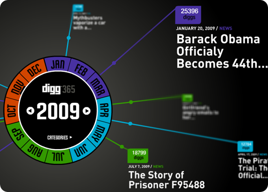
1.365
Digg 365 surfaces the top ten stories on any given day, month and year. You can also see the top ten stories by category per year. Roll over the colored arcs to show display the months; clicking on it brings an outside arc to choose a specific day.I have shown the data for entire 2009
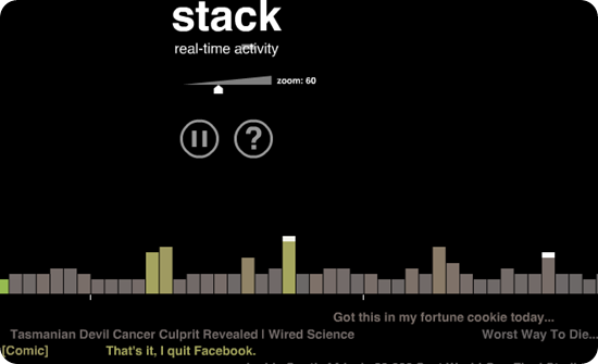
2.Stack
Digg Stack shows diggs occurring in real time on up to 100 stories at once. Diggers fall from above and stack up on popular stories. Brightly colored stories have more Diggs
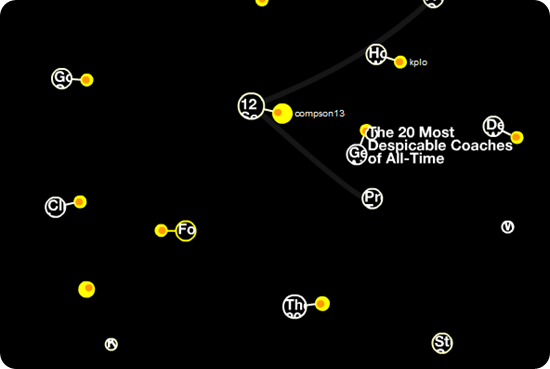
3.Swarm
Digg Swarm draws a circle for stories as they’re dugg. Diggers swarm around stories, and make them grow. Brightly colored stories have more Diggs.
4.Bigspy
Digg BigSpy places stories at the top of the screen as they are dugg. As new stories are dugg, older stories move down the list. Bigger stories have more Diggs.
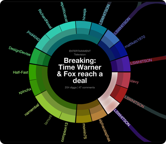
5.ARC
Digg Arc displays stories, topics, and containers wrapped around a sphere. Arcs trail people as they Digg stories across topics. Stories with more Diggs make thicker arcs.
6.Pics
Digg Pics tracks the activity of images on the site. Images slide in from the left as people Digg and submit them
7.TwitEarth
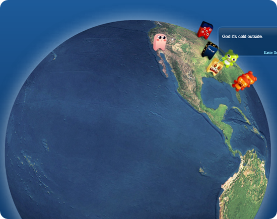
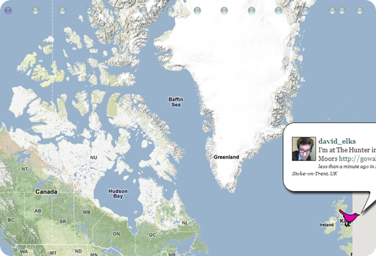
Great visualization tool for twitter
8.Twitter vision
9.News Map
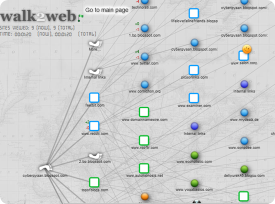
10.walk 2web

