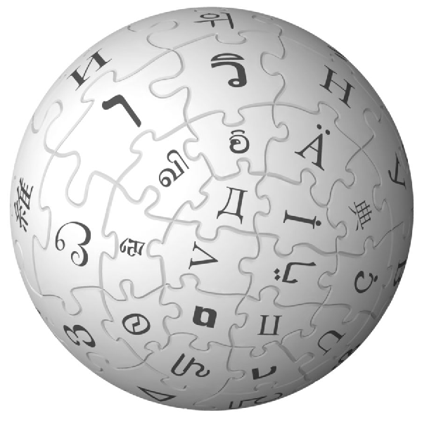
Wikipedia worlds largest online encyclopaedia has updated its design and minor change to its logo.This change is aimed to increase the usability further.
Here’s what’s new:
- Look and feel: We’ve introduced a new theme we call “Vector” which makes essential functions easier to find.
- Navigation: Improved navigation for reading and editing pages. Now, the tabs at the top of each page more clearly define whether you’re reading or editing a page. There’s also a collapsible navigation for the left sidebar that hides items that aren’t used often, but allows them to continue to be easily accessible.
- Editing improvements: Now, formatting pages is simpler and more intuitive with tables, Find and replace functionality
- Link wizard: An easy-to-use tool allows you to add links to other pages on Wikipedia, or to pages on external sites.
- Search improvements: Search suggestions are now improved to get you to the page you are looking for more quickly.
- Pediapress book creator: Create a book by selecting Wikipedia articles and adding them to the Book Creator. Your articles will be turned into a PDF (or OpenDocument) file so you can easily take Wikipedia wherever you go.
- Updated logo: The well-known Wikipedia logo have been enhanced and improved.
Further design information is available at Wikipedia blog post
Old Logo
New logo with a 3D touch
Logo viewed at different angles
Wikipedia as printed book
![wikipedia_thumb[5] wikipedia_thumb[5]](http://lh3.ggpht.com/_ZwsZkFqqa4s/S-vpb9-4DgI/AAAAAAAABLk/jYqap1gSt5o/wikipedia_thumb%5B5%5D%5B6%5D.png?imgmax=800)
![600px-wikipedia-logo_thumb[10] 600px-wikipedia-logo_thumb[10]](http://lh3.ggpht.com/_ZwsZkFqqa4s/S-vpckApklI/AAAAAAAABLo/AK9wYtxeNgA/600px-wikipedia-logo_thumb%5B10%5D%5B4%5D.png?imgmax=800)
![wikipedia_thumb[10] wikipedia_thumb[10]](http://lh4.ggpht.com/_ZwsZkFqqa4s/S-vpdgCOugI/AAAAAAAABLs/xOuheva_cJk/wikipedia_thumb%5B10%5D%5B4%5D.png?imgmax=800)
![About_the_official_Marks_thumb[2] About_the_official_Marks_thumb[2]](http://lh3.ggpht.com/_ZwsZkFqqa4s/S-vpeU-WTTI/AAAAAAAABLw/ZHFtrF8MFic/About_the_official_Marks_thumb%5B2%5D%5B4%5D.png?imgmax=800)
