Google begins rolling out the design changes to all of its services one by one.After Google revamped the most popular homepage with the slick top navigation bar and removing cluttered links.
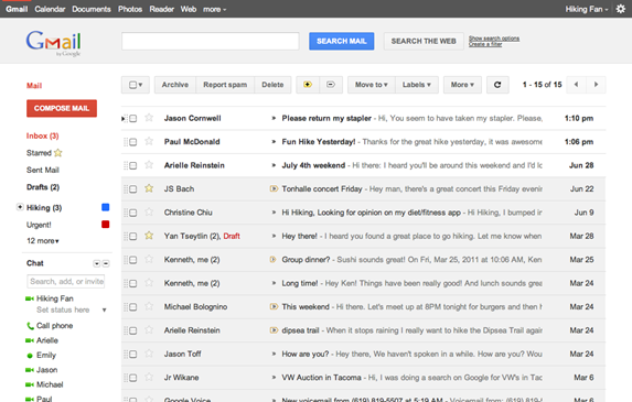
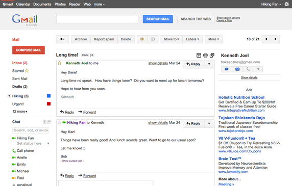
The next best thing after search is Gmail, Google now allows us to switch to new theme that is similar to the new UI used by google+.
Gmail is not going to switch to new UI right away instead it allows us to preview the new look and later on implementing to everyone. Starting today you can able to see the new themes “preview” and “preview dense” under the “themes” tab.
Once you apply any one of this theme you will be switched to new UI and there are some points to be noted in this new look.
1.Colours
Entire Google network is moving to this new grey-brown-red-blue colour scheme like Facebook goes in for blue.
2.The Floating Bar
The static buttons are now replaced with floating bar.
3.Advertisement
Hard to notice the floating ad bar at the bottom.
4.HTML 5 & CSS3
The new look and feel is to made available for all kinds of browsers and displays.
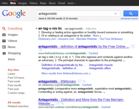
Google results page with blended colours.
so what do you think about this change ? Google looks for your feedback


