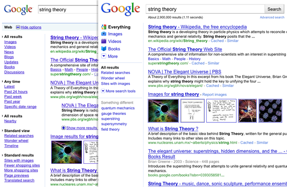
Google rolled out a new search interface yesterday.Have you noticed the change when you search google ? The new interface increases the richness of the web and enhances the Look and feel.In a post from google blog the new design was explained better.
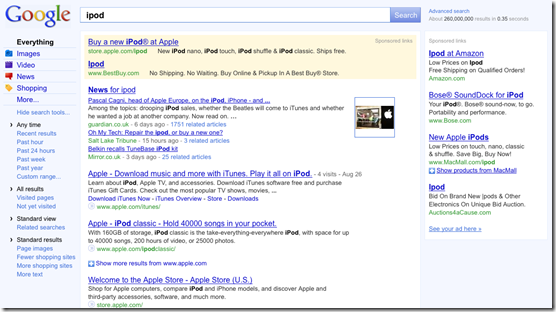
What’s new in the new design ?
- Simple left hand navigation , with drop down selection
- Renamed “Web” with “Everything” label
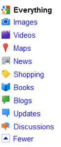
- Colour full icons for search categories
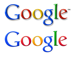
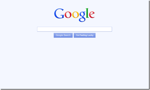
- New Logo and buttons
Old vs New logo
 The new logo is much lighter than previous one.
- Footer bar with blue background is removed also the underline for links are removed
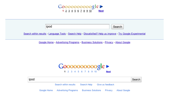
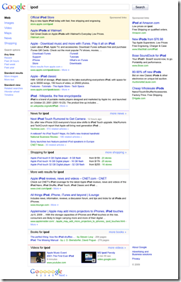
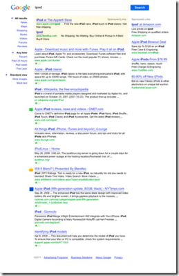
The UI designers at Google have tried out several designs. (Click to magnify )
What do you think about this new interface ? let us know
