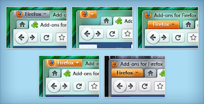
Firefox 4.0 Windows theme mockups are released by Mozilla.The new design emphasizes various UI developments which makes web browsing very comfortable.
Early Screenshots for firefox 4.0
- Firefox 4.0 Design has undergone many changes so far Firefox 3.7 now Windows UI.
2. Buttons
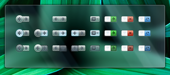
The menu bar buttons is replaced by buttons [ occupies less space ]
3. App Button
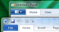
The app button is inspired by Microsoft office 2010 design.
4.Configurations
Firfox 4.0 has some configurations planned for certain uses
With BookMarks Bar:
Tabs Under Notification bar:
Tabs Under the Navigation bar with bookmarks bar:
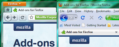
Comparison with Firefox 3.5 :
Button States:
windows
Mac
Large Button Mode :
The navigation button will be large as seen in firefox 3.5
Small Button Mode:
The navigation button will be smaller
- Further Tabs on top , Tabs on Bottom mode are designed, with the tabs above/below address bar
- New Notification System in firefox 4.0 is upgraded from 3.5, Its been Conceptualized here
Further UI articles for Firefox 4.0 Menu , Theme, screenshots, developers blog,
Design Competition
